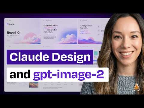
Claude Design is slow and I love it anyway (plus why I love ChatGPT Images 2.0)
Claire Vo (host)
In this episode of How I AI, featuring Claire Vo, Claude Design is slow and I love it anyway (plus why I love ChatGPT Images 2.0) explores claude Design excels at brand systems, slides, but runs slow Claude Design stands out by making design systems a first-class input, enabling more brand-faithful prototypes than typical AI prototyping tools.
Claude Design excels at brand systems, slides, but runs slow
Claude Design stands out by making design systems a first-class input, enabling more brand-faithful prototypes than typical AI prototyping tools.
The tool is notably slow and heavily rate-limited, which creates friction and keeps fast, direct-manipulation tools like Figma advantaged for rapid iteration.
Claude Design’s three-variation output and tweak controls reduce prompt-iteration burden and help non-designers choose among options visually.
Claude Design performs especially well for marketing-style landing pages and branded slide decks, while feeling weaker for complex app UX components.
ChatGPT Images 2.0 is positioned as the first “thinking” image model, showing strong improvements in typography and layout for brand kits and infographic-like outputs.
Key Takeaways
Treat a structured design system as the unlock for brand-consistent AI design.
Vo shows Claude Design can ingest HTML, logos, and fonts to infer colors/typography/components, producing outputs that feel closer to an existing brand than generic AI prototypes.
Get the full analysis with uListen
Claude Design is best when the deliverable is marketing collateral, not complex product UX.
Landing pages and decks benefit from strong copy, componentized sections, and brand styling, while app-like UX patterns and design-system reasoning for product UI feel less reliable.
Get the full analysis with uListen
Three variations is a deceptively powerful UX pattern for AI design tools.
Instead of forcing users to describe changes in prompts, Claude Design surfaces multiple directions up front, helping users pick and refine visually—similar to fast A/B exploration.
Get the full analysis with uListen
Speed and limits are currently the main blockers to Claude Design replacing Figma.
Waiting 5–10 minutes for generations and hitting weekly caps (leading to a $200 upgrade) breaks the tight feedback loops designers rely on for day-to-day iteration.
Get the full analysis with uListen
Figma still wins when no model needs to be “in the loop.”
Direct manipulation—dragging, resizing, changing fonts instantly—remains superior for micro-iterations, making Figma a durable canvas even if AI tools handle first drafts.
Get the full analysis with uListen
Slides may increasingly become ‘code-first’ artifacts.
Vo highlights Claude Design’s decks as code-backed, enabling delightful elements (e. ...
Get the full analysis with uListen
ChatGPT Images 2.0 is especially valuable for typography+layout-heavy imagery.
The model generates credible multi-panel brand kits and infographic-like layouts with fewer “AI text” artifacts, and improves further when guided by reference images to match a house style.
Get the full analysis with uListen
Notable Quotes
“What I think makes Claude Design really interesting is they're making the design system a first-class citizen of this design tool.”
— Claire Vo
“This is gonna take about five minutes—and it did.”
— Claire Vo
“The number one problem we all have with Anthropic products is there's too many limits.”
— Claire Vo
“I have to say, this is where Figma really wins.”
— Claire Vo
“It is the first model that can do thinking, and they've really focused on text and the ability to render text and objects accurately.”
— Claire Vo
Questions Answered in This Episode
When importing a design system via saved HTML and assets, what specific inputs (CSS, component markup, images) most improve Claude Design’s fidelity?
Claude Design stands out by making design systems a first-class input, enabling more brand-faithful prototypes than typical AI prototyping tools.
Get the full analysis with uListen AI
How would you rewrite or augment the generated design system to fix common issues like the “italicized serif font” tendency you noticed?
The tool is notably slow and heavily rate-limited, which creates friction and keeps fast, direct-manipulation tools like Figma advantaged for rapid iteration.
Get the full analysis with uListen AI
What parts of Google Labs’ DESIGN.md standard seem most important for cross-tool compatibility, and what’s missing for real-world teams?
Claude Design’s three-variation output and tweak controls reduce prompt-iteration burden and help non-designers choose among options visually.
Get the full analysis with uListen AI
For teams evaluating Claude Design vs. Figma, which workflow stages (idea → prototype → handoff) do you think Claude can own today without creating rework later?
Claude Design performs especially well for marketing-style landing pages and branded slide decks, while feeling weaker for complex app UX components.
Get the full analysis with uListen AI
How would you quantify whether the three-variation approach actually reduces iteration time compared to prompt-based refinement in other tools?
ChatGPT Images 2. ...
Get the full analysis with uListen AI
Transcript Preview
[upbeat music] Welcome back to How I AI. I'm Claire Vo, product leader and AI obsessive, here on a mission to help you build better with these new tools. This week, there has been so much released in the AI for design space. Whether you're looking at Claude Design, trying to decide if it's really gonna replace Figma, or want to know if the new GPT Image 2 model is actually that good, I've got you covered with a mini ep where I'm gonna show you what I really think about these new design tools and how they'll work for your business, and a couple fun use cases. Let's get to it. This episode is brought to you by WorkOS. AI has already changed how we work. Tools are helping teams write better code, analyze customer data, and even handle support tickets automatically. But there's a catch. These tools only work well when they have deep access to company systems. Your copilot needs to see your entire code base. Your chatbot needs to search across internal docs. And for enterprise buyers, that raises serious security concerns. That's why these apps face intense IT scrutiny from day one. To pass, they need secure authentication, access controls, audit logs, the whole suite of enterprise features. Building all that from scratch, it's a massive lift. That's where WorkOS comes in. WorkOS gives you drop-in APIs for enterprise features so your app can become enterprise ready and scale upmarket faster. Think of it like Stripe for enterprise features. OpenAI, Perplexity, and Cursor are already using WorkOS to move faster and meet enterprise demands. Join them and hundreds of other industry leaders at workos.com. Start building today. I have to start today's mini episode with a little bit on Claude Design. In case you missed it, last week Anthropic released Claude Design, and it's their web-based design tool really focused on a couple areas, prototypes, including wireframes and high-fidelity prototypes. People are asking, "Is this gonna replace Figma in the design flow?" Spoiler alert, I think it might actually replace some of these prototyping tools that everybody's using before they go to engineering, and also is taking a swing at slides and videos, which I think is kind of interesting, and also has templates for animations and videos, which we can also show a little bit of on this episode. But what I think makes Claude Design really interesting is they're making the design system a first-class citizen of this design tool. So the first thing I did was actually go in and just import my design system, and I think this is really smart because the number one complaint I know people have about using prototyping in the product development life cycle is, "It never matches my brand. It never matches our design system." And these prototyping tools, while I think great, you know, the Lovables, the V0s, the Bolts, et cetera, also have this concept of design system import. I really haven't found they get perfect at replicating my existing design in my code base. And so I really wanted to test this use case for Claude Design and see if it actually works. So the first thing I did was really import my design system. Importing a design system is pretty easy, and I'm actually gonna show you how to do it by importing Lenny's Newsletter design system. So if you see here, this is what I filled out to import Lenny's design system. Sorry pal, we'll see how this looks. I really just went to his homepage. I clicked Save on the HTML. I saved the logo. I saved our little campfire here. I saved this nice little graphic, and I just put it in here in the Claude Code Create Your Design System form. So I said, "It's Lenny's Newsletter." I don't have access to his GitHub. If you wanna give me access, friend, [chuckles] I can, I can make this even better. I uploaded just a saved HTML and some images and then added those fonts, logos, and assets. I didn't even put in additional notes here. I just left it blank. And then as you can see, Claude Design goes ahead and starts exploring the provided materials and wants to understand the newsletter and then build out your design system in the format that they need. And what's really interesting here is they warn you. So th- they say, "This is gonna take about five minutes," and it did. It took about five minutes. And you look along the side on the reasoning, it's pretty interesting to see how it extracts the design system. It's looking at the HTML and key images. It has a visual picture now. It has a sense of what core, uh, colors and other things it's gonna work, and then it's gonna build out this structure of a design system, sort of in a skills and documentation mode, that then Claude Design is going to use. And looking here, I think it looks pretty good. If you look at this, it looks pretty comparable to this. I would say the only difference is Lenny uses sans serif fonts for his headers. So what I might say is, you know, "We typically use sans serif fonts for the main headers other than top level." Switch that, but otherwise it looks good. The other thing that is pretty cool here is there's, you know, the newsletter kit, the typography, colors. So you can actually see how it breaks down the idea of a design system. Even if you're not gonna use Claude Design, the idea of breaking your design system for any AI tool into these components, UI kits, typography, color, components, and brand marks, is really interesting. In fact, just today, Google Labs released the DESIGN.md standard, which they're trying to make sort of a standard AGENTS.md or SKILLS.md standard across how you would describe a design system for use in Google's design tools, but also other AI design tools. And so you're really seeing a lot of these solutions move to the concept of a structured design system that then can be used by AI to render consistent high-quality UI against your experience. So this design system is really interesting.I also created one from ChatPRD. The one that I did here, I used the actual GitHub, so I hooked up the very specific GitHub directly to, um, this app. So it pulled in some pretty specific components and UI, um, across our app and our marketing site. So you can put as much or as little as you want into these design systems, but I think it's a really interesting flow. And then going back to the core capabilities of Claude Design, I just wanna show you a couple things that I thought was really interesting. One is I think its ability to adhere to a design system for marketing specific landing pages and websites is really good. So if you are on the marketing side and you have been sitting out doing prototyping because it's so hard to get your brand assets into a really nice workflow, I think Claude Design is a really great one for you because it's particularly good at that. Okay. So I'm gonna use Lenny's design system and really show you what this looks like in practice. So let's say Lenny's gonna come into competition with ChatPRD, and we're gonna create the Lenny PRD builder using the Lenny design system, and we're gonna have a head-to-head compete, Lenny or Claire, who writes better PRDs? Well, [chuckles] I'm gonna use Claude Design, the Lenny's Newsletter design system, and I'm gonna say PRD Maker, and I'm gonna click create on this high-fidelity prototype. I'm gonna start with the design system. You can see it's already selected down here. It's an interactive prototype, and we wanna do hi-fi design. And I'm just gonna use my monologue to write in here what I want. "Please help me make a landing page for a PRD generator and AI PM coach powered by all the data in Lenny's newsletter adhering to the Lenny newsletter design system. Make it awesome." Make it awesome is the design version of please, Claude, make no mistakes. So I'm gonna go ahead and send that in. And if you're looking for a little bit of fun, we have a couple new loading messages here over in the Claude AI design loader. It's not [chuckles] flibber jittering or whatever it used to be in Claude Code. It does things like saute onions. Very funny. Okay, so it's gonna ask me about the PRD generator landing page. Again, I really love this Q&A functionality that's in Claude Code, and they've made it very nice in Claude Design. The product is called Lenny Doc, and it's gonna help you... An AI PM in your pocket is trained on Lenny's archive. Lenny, please don't compete with me. I'm tired. All right, who's the primary audience? New and aspiring PMs. It's gonna be pure Lenny. Um, decide for me on what sections I should include, how interactive should it be. I'm gonna do small live interactions, but not the full thing. Again, this is for a prototype. I'm gonna let it decide pricing. I love this. If you haven't seen this in Claude Design, [lips smack] they give you little wireframe hero style directions, and I even got one of these that said, "Tell me what appeals to you." I love that so much, and for me, I'm just gonna go with this. This appeals to me. I don't know. I just like it. And then I'm gonna just let it decide. And then here's another really cool function of Claude Design. It gives you variations, which as somebody who has spent so much time in AB testing in her career, I think is so fun. You can decide how many options you want. You can get one option. You can get three options. You can get five options. It defaults to three. And I think this is really smart from a design tool perspective because often those cycles of no, make it better or, or make it different can be very slow, and most people coming to Claude Design probably don't have the ability to articulate exactly the changes they make. So it's really smart to put three separate ideas in front of the consumers of Claude Design and let you pick what you like and figure out just from looking at it versus having to iterate with a prompt. Anything else you should know? No. We're gonna continue here and, ugh, and we ran out of credits. Okay, BRB. The number one problem we all have with Anthropic products is there's too many limits. I immediately hit my limit. I've only done about two or three things in Claude Design, and I am blocked until Saturday, and it is Tuesday. So I went and paid my Claude chits to the Anthropic gods. Let's see if it'll let me try again. Yes, two hundred dollars later, we are back. All right, so it's gonna go ahead and create this landing page for this Lenny tool builder. Now, another piece of feedback that we're gonna have to deal with during this podcast is it is slow. And I think one of the places where Figma is gonna continue to win, and we saw this in our How I AI episode with the Figma team about how they use MCPs. With design systems and design tools in particular, you want really short feedback loops. If you don't like how something looks, you want to be able to change and modify it pretty immediately. And I have to say, this is where Figma really wins. Just your ability to drag things, change things, change the font without having to wait for an LLM call, without having to top up your credits. Immediately, there does not need to be a model in the loop. I think we underestimate how nice that is from a speed of iteration perspective when you're building and designing things. And I think that is one reason why Figma will continue to be a nice iteration and design canvas for any kind of design work because honestly, the cycles are so slow here with Claude Design. This is probably gonna have to take about five to ten minutes. I, I should step away from this, but we're gonna pause, come back to it when it's done sauteing and shelling as it says in the waiting. I'm a founder, so I know most people don't start companies because they love running payroll or managing complianceBut somewhere between hiring your first employee and raising your next round, you end up in the weeds with HR, IT, and all that other stuff. That's what Rippling was built to solve. Rippling is a unified platform that lets startups run HR, payroll, IT, and finance in one system from day one. The Rippling startup stack replaces disconnected tools that don't sync with a fully connected platform. Over fifteen thousand startups, including Cursor, Clay, and Sierra, trust Rippling to scale fast without adding additional ops and HR headcount, so founders like you can keep building. Right now, venture-backed startups can get six months of Rippling startup stack for free. Head to rippling.com/howiai and sign up today. That's R-I-P-P-L-I-N-G.com/howiai to sign up for six months free today. Focus on what you're building and leave the rest to Rippling. Okay, that did take about ten minutes, but we have got Lenny Doc, the ChatPRD competitor by my friend and partner, Lenny. And you can see here it really did match some of his general branding from the Lenny's Newsletter. So colors look right, logo looks right. I will tell you the number one Claude Design sloptel is it loves an italicized serif font. It loves this in a landing page, but it's pretty good. And I would say, you know, if, if Lenny was gonna make something, it would look much more like this versus what the ChatPRD brand looks like. So I don't think this is too far off, and it's done some great stuff here. It's been a prototype of a starter component. It's pulled in some value propositions. It's shown what the chat looks like. It even put in some content marketing here, so I gotta be really careful pulling Lenny's content. And then we have to call out the ability to do tweaks and versions in Claude Design. So because I asked for three versions, it's gonna have these tweaks that it can do. Do you want an operator headline? Do you want blunt headline? Do you want a question headline? Oh, I love what would Lenny do. Hero layout, I asked for centered, so I want centered, although that looks too much like his newsletter, so I'm gonna go with side mark. Background, do we want this nice cream or white? I like white. What's the primary CTA? We're growth people here. We do try it free. We love PLG motion. And then do you want on or off the product pass bundle? Do you want a pricing section? I think this is so fun. And imagine just being able to iterate so quickly with this design. I really like it. A couple other things that you might miss in Claude Design that I think are nice, you can comment on specific components. Let's say I think this CTA is pretty bad. I can say, um, "Improve the CTA text," send that to Claude. Claude's gonna improve that. I can draw, do circles on things, add notes, call out things. So it is a really natural way to interact with a design. It's kind of the best of a prototype envision, when we used to have that, of, of commenting, a FigJam, a Figma, comments, all that kind of stuff, but here with AI that can actually make those changes for you. And I think the design went pretty well. Now, this is an example of something pretty straightforward. Again, I think it's better at marketing style design, these kind of components that you see here that are more like landing cage components than the UX design. I found that it doesn't quite reason with design systems and user experience components and app components as well, but I think this did a pretty good job. Another use case that I think is really interesting is Claude Design can make slides. So I chose that landing page, Lenny's Newsletter design system, and I actually dropped my OpenClaude article that I wrote for the newsletter in as a PDF, and I said, "Let's build a deck teaching people how to set up OpenClaude based on this article." And this is where I think it really shines. It looked at the design system, looked at the content, and built a really nice presentation for me to present OpenClaude and how to set it up. And you can see here it just looks really nice. And so if you're someone that has to put together decks for customers, you have to put together instructional material, and you really want that to match your branding, I think product marketers, you really need to pay attention for things like training, enablement, and customer decks. I really think this does a very nice and elegant job of designing a deck. And even look at this. I had a command in the terminal as part of my article, and it actually put in a really cute fake terminal here with a little blinker. And this is the fun parts of the Claude Design slides, is they're actually just code behind the scenes. I think this might be where we're going with slides overall, is slides just end up being code like everything else. And so you can get these cute little design elements that I think are really delightful and fun in the app. So if you're looking for a really practical use case where I think it does quite well, take straight content and turn it into a beautiful deck matching your brand. And then my final very important Claude Design use case, it gets very fun to imagine crazy versions of your web experience or website. When you give Claude Design no design system, it does the best. So I asked Claude to make a '90s GeoCities style version of the Lenny's Newsletter homepage. It did that. It is called Lenny's Product Zone.And it is pretty incredible. And even the tweaks component that we had that was so nice in the polished landing page version is now real ugly. I'm going with Bricks. I'm going with Comic Sans of course, and I want all the things, so I'm gonna leave all these tweaks here. And look at this beauty, "Your OKRs are cringe, and seven ways to fix them before Q3." And this is a secret power of Claude Design. It writes exceptional copy. So if you let it run on copy, which is such an underappreciated part of building a great prototype or design, it's gonna do a really, really good job. And so I highly recommend finding a reference style. Ah, Jamie Gannon makes a really good point on this in her episode of How I AI, is if you understand reference styles, you can reference and explain what you want, but let it go pretty wild without a design system, and then you will get very, very cool designs. So I'm going to, as soon as Lenny gives me access to his GitHub to kind of push this right up, I think it's gonna convert, convert like crazy. So let's ask him to ship it. Write in the comments if you think this is what Lenny should redesign his website to. So those are my three Claude Design use cases, import your design system and create a new more marketing style landing page. Use content plus your design system to create really, really beautiful slides, and then go ham on an ugly redesign of your website, or ugly or beautiful, depending on what you think. And fax us at 1-800-PRODUCT, which is exactly what this landing page says is the way to get in touch with my friend Lenny if you think he should shoot-- ship Lenny's Product Zone. Okay, I just wanna show you two more things really quickly before we go, and those things are how I think you can use the new GPT image model two to get some brand work and also some fun image work done. Okay, so just today, ChatGPT, OpenAI released ChatGPT Images 2.0 model, which is a new era of image generation. It is the first model that can do thinking, and they've really focused on text and the ability to render text and objects accurately. And I just wanted to show you two use cases that I think are pretty interesting and how well I think the new image model from OpenAI performs. The first one is kind of back to what we were talking about before, which is brand. And I saw this prompt on X, and I, I copied it for ChatPRD to see what we would get, and it's basically the idea of creating one of those multi-page brand kits for your company. So I asked it to create it for my company, ChatPRD. I just gave some general kind of brand design guidance off this. I had ChatGPT write this for me and asked it to generate it. And what I will say is it did a really lovely job in terms of text. It doesn't have that classic, like, GPT image text look to it, so typography has gotten a little bit better. I think the-- it's kind of amazing it can do this nine grid layout of different parts of the brand kit, and I don't think it's bad. It's just not me. And so I loaded up some images from Midjourney here that I think we use more in our brand kit, and I say, "That's not really us. Here are some reference images. Update the brand kit." And let's see what it does with that. I'm gonna make it create an image. Hopefully, I'm hoping it should read these images, which are much brighter, much pinker, um, have this, like, sort of pixelated feel to them, and create a brand kit that looks l- more like what I would wanna use. And I think this is just such a neat workflow. I've heard a lot from people that they're really dissatisfied with the current image models for marketing purposes because it requires so much bringing together of images and text and typography and voice. And while I think something like a Claude Design obviously can do that well at the web asset level, sometimes you want it at the brand or image asset level, and I think it's really interesting to see if GPT Image 2 can do this. So let's see what it generates. It's finishing up right now. Let's see how pink it is and if we love it. Oh my gosh, I actually really love it. It makes me so happy. As you can see, it took in this, like, sort of pixelated landscape-y images that we've been using for ChatPRD. It is certainly more pink, and it has given me kind of a new idea of what we could do with this brand kit. Now, we got an amazing brand kit done by designers. I think it's probably scientifically five to 50 times better than this. But if you were looking for somewhere to start, I think that GPT Image 2 is quite good at this. And this doesn't have that very obvious AI image text tell on the typography, and I think something like this is a really great starting point for folks that are trying to get images done. And then finally, one last fun use case it just finishes-- finished over here, which is taking my image and doing my color analysis. For, for the boys in the room, this is something that the ladies often do to figure out what colors look best on what they're wearing. And so I uploaded a photo and asked GPT Image one-- Image 2 to make me a color analysis, and it gave me warm neutral. My best colors are these earthy, warm colors, and even put me in those colors here, down here. Now, my face got real weird towards the bottom. My teeth are looking kinda funk over here.But overall, I would say this is pretty impressive. This is something that people spend a lot of time putting together for folks. Now, what I would say, GPT 2, is I am actually a dark winter, so I might come in here and say, "No, I'm a dark winter. You're just confused by my old h- highlights." My hair looks much blonder in the picture than it naturally is. It's actually very dark. Um, and so let's see [laughs] if it revives us to my exact color palette. But again, think about the combination of text, color, image analysis, layout, quite lovely. And I haven't seen a model do this kind of layout work effectively. You know, I think Nanobanana had gotten close with infographics and things like this, but we might actually switch some of our infographics and graphic generation over to GPT Image 2, because I think it just looks a little bit more expensive and a little nicer. All right, here we go. This actually looks really great. This is the correct color analysis for me. My natural hair color is actually the one in the middle. Don't tell anybody. And these are the colors. Now, again, my face gets... It's really weird down here, and I would never wear these clothes. I am not a business lady. I am a hacker podcaster. But in terms of the colors, in terms of the layout, in terms of the photography, the typography, this is pretty impressive, and I would pay a lot of money for somebody to do this for me. So if you're looking for a fun Mother's Day gift out there, take a photo of your lady, one where she's looking good, and throw it in here and ask for her color analysis, and then buy that person some jewelry. All right, so this is the design-focused Spring 2026 drop. We looked at Claude Design and how good it is at importing design systems, creating marketing style landing pages and slide decks, and then translating your current website into something a little bit more fun. We looked at the new GPT model, GPT Image 2. Two things I think it's really, really good at, layout and typography. It has really nailed those things and has also just upleveled the quality of design because this is the first image model that really does some thinking. I think it's great. And we talked about Google's DESIGN.md standard, which they're trying to make the standard way for agents to understand your design system and brand. It's been a really exciting week. At the end of the day, I don't think any of these tools are dead yet. They all have their benefits, they're all slow, and they're all making me top up my tokens. I'll see you soon, where we'll look at all the new AI tools. And until next time, hope you have fun building. [upbeat music] Thanks so much for watching. If you enjoyed the show, please like and subscribe here on YouTube, or even better, leave us a comment with your thoughts. You can also find this podcast on Apple Podcasts, Spotify, or your favorite podcast app. Please consider leaving us a rating and review, which will help others find the show. You can see all our episodes and learn more about the show at howiaipod.com. See you next time. [upbeat music]
Install uListen to search the full transcript and get AI-powered insights
Get Full TranscriptGet more from every podcast
AI summaries, searchable transcripts, and fact-checking. Free forever.
Add to Chrome